
Bathroom Décor: Small Tile, Big Personality
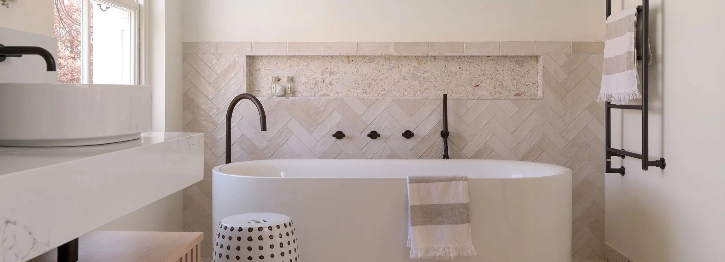
Mosaics, kit-kat tiles, metro tiles and scallops may be small in scale, but they can have a huge impact on a bathroom. From playful shapes to unexpected layouts, here is how to give smaller-format tiles a personality of their own.
When it comes to creating a statement, bigger is not always better. Large-format tiles can make a bathroom feel beautifully seamless, but smaller tiles bring something different: rhythm, texture and an opportunity to be creative.
Even the simplest tile can be completely transformed by the way it is arranged. Turn it vertically, stack it neatly, introduce a contrasting grout or create a herringbone pattern and suddenly a familiar design feels fresh again. Whether used across an entire room or within one carefully chosen area, small-format tiles prove that personality often lies in the details.
Mosaics: small pieces, endless possibilities
Mosaics have been used to decorate interiors for centuries, yet they continue to feel relevant because of their versatility. Available in glass, porcelain, ceramic, stone and metal, they can be subtle and tonal or bright, intricate and expressive.
Their small scale makes mosaics particularly useful on curved surfaces and in compact or awkward spaces. They can follow the shape of a bath, soften the edge of a vanity unit or wrap neatly around a shower bench. Used inside a niche or as a narrow border, they add detail without taking over the room. Across a whole wall, the repeated pattern creates a wonderfully immersive effect.
For a calm scheme, choose mosaics in closely related shades and let the variation in tone and texture provide the interest. If you want something bolder, try a contrasting colour or a design that brings several shades together. The many grout lines naturally add texture, so even a simple one-colour mosaic can feel full of character.
Kit-kat tiles: slim, stylish and surprisingly versatile
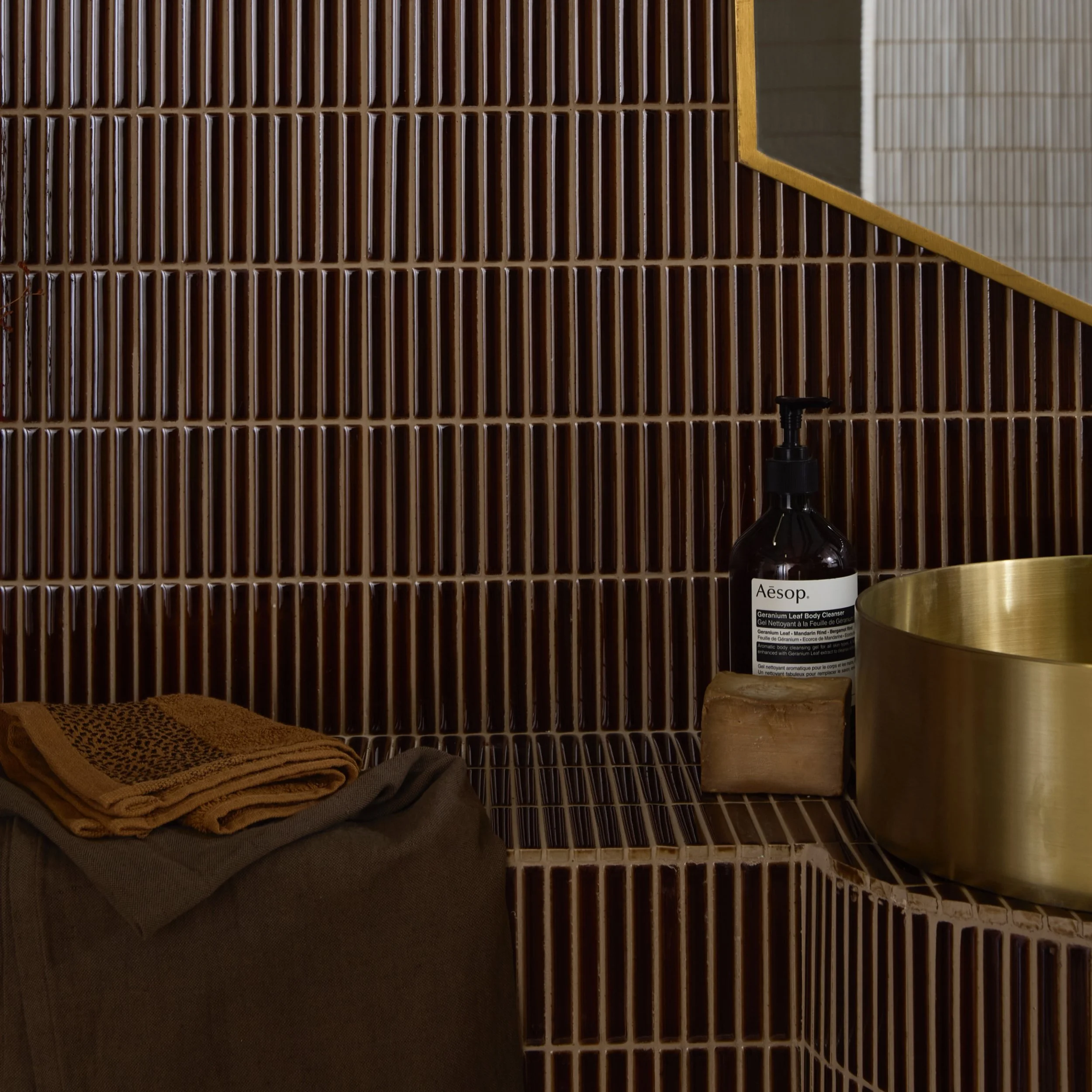
Named after their resemblance to the familiar chocolate bar, kit-kat tiles are long, slim and perfectly suited to adding texture. Their narrow shape creates a strong sense of movement, making them a brilliant choice for walls that need a little more energy.
Laid vertically, they draw the eye upwards and can help a room feel taller. Used horizontally, they visually widen the wall and create a calmer flow. Their linear quality works especially well behind a basin, around a bath or across the back wall of a shower.
A glossy finish will catch and reflect the light, highlighting every subtle variation in the surface. Matt kit-kat tiles feel softer and more architectural. Deep greens, inky blues and earthy shades create a confident focal point, while warm white or pale neutral versions offer texture without introducing a strong colour.
Metro tiles: a classic with more than one personality
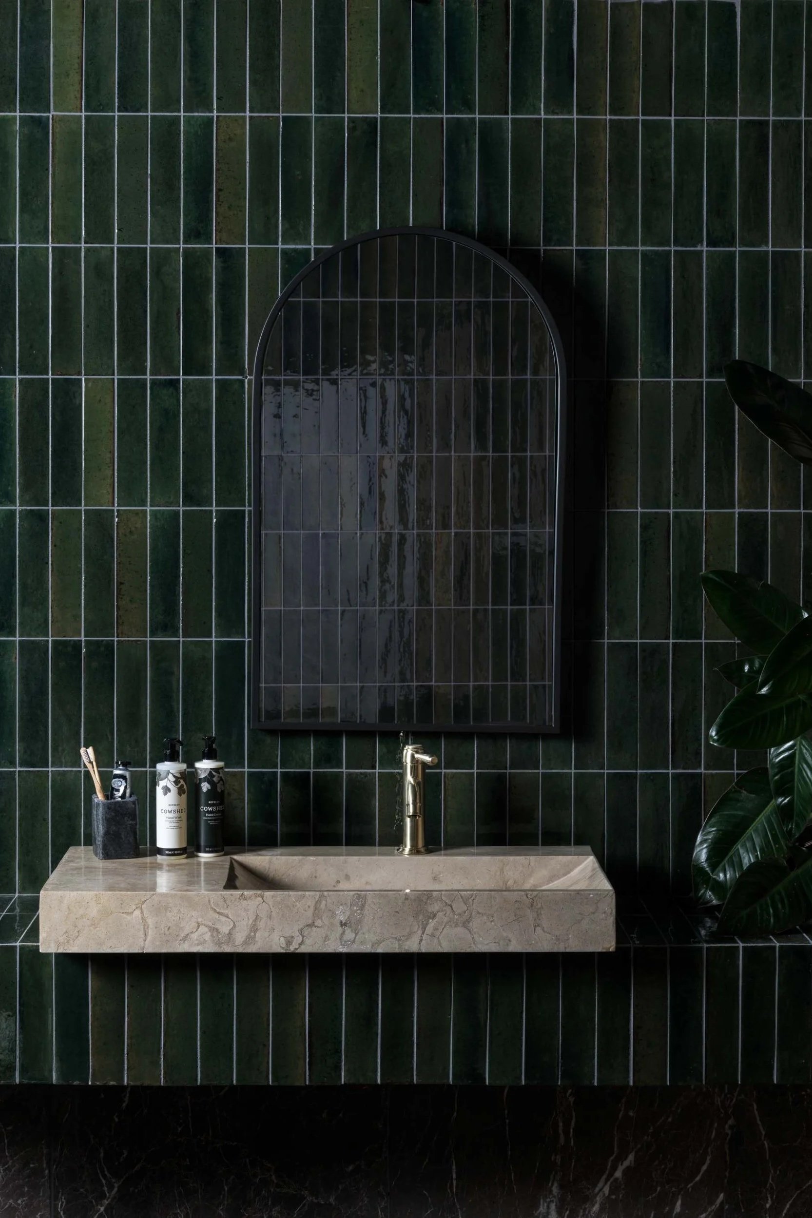
Metro tiles are familiar for a reason. Their simple rectangular shape works in almost any bathroom, but that does not mean they have to be predictable. Colour, finish, grout and layout can each change their character completely.
A traditional brick-bond arrangement has an easy, timeless quality, particularly in white or softly coloured glazes. Stack the same tiles in a clean grid and the result becomes sharper and more contemporary. Turn them vertically and they feel instantly less conventional, while a herringbone layout creates movement and makes even a neutral tile a feature.
Bevelled edges give metro tiles a more classic look by creating highlights and shadows. Flat tiles feel cleaner and quieter, allowing the colour or layout to take centre stage. If you love the shape but want something different, look beyond white: olive, burgundy, ochre, soft pink and deep blue can all give this classic tile a new point of view.
[image: Foundry Novo Porcelain Bathroom Tile, Ripples]
Scallops: curves with a playful edge
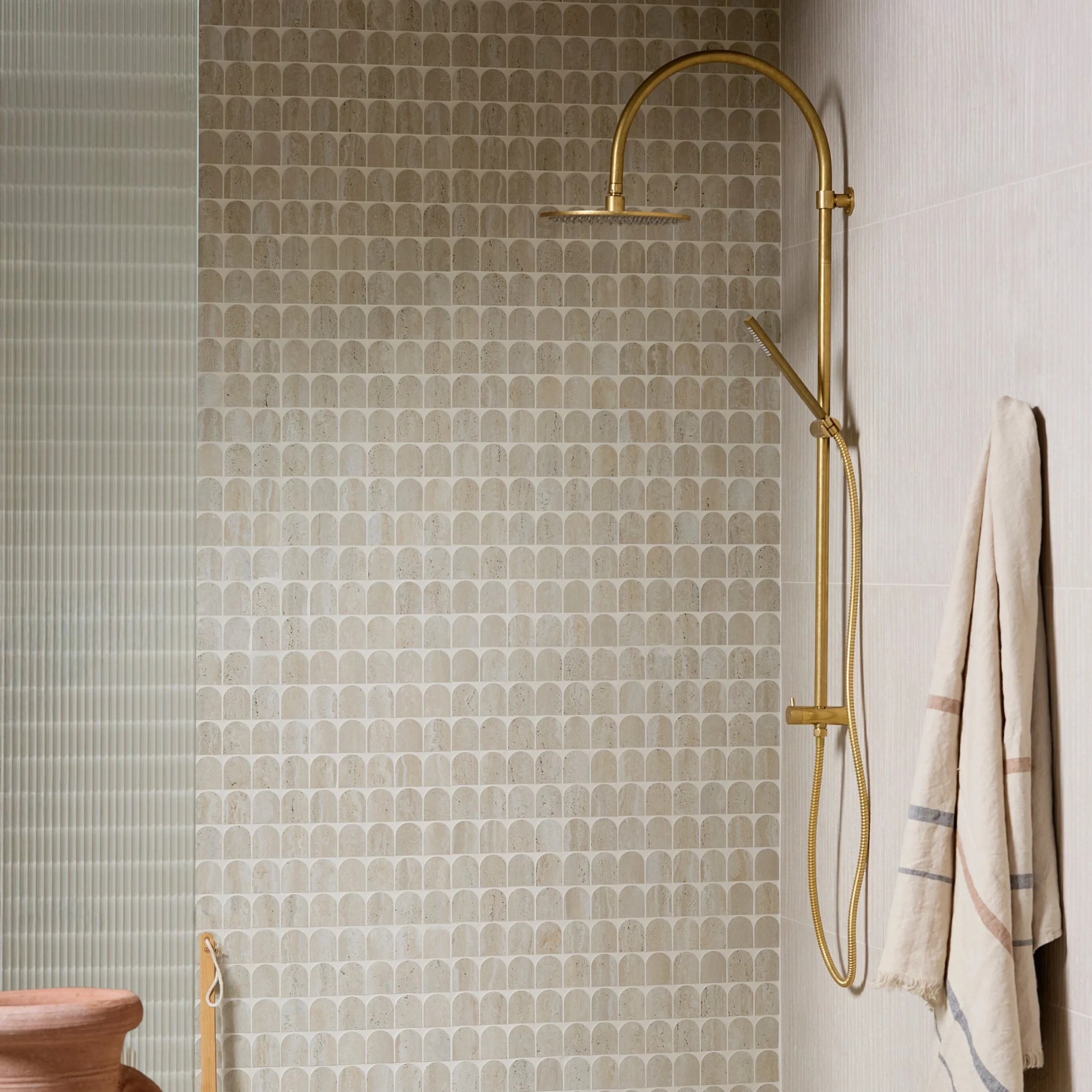
Scallop tiles bring softness to a room filled with straight lines. Their curved shape can resemble fish scales, fans or overlapping leaves depending on which way they are laid, giving you several looks from one design.
Positioned with the curve facing upwards, scallops have a softer, cloud-like quality. Turned in the opposite direction, they create a more decorative fish-scale effect. They are especially striking across a vanity splashback, within a shower or on a cloakroom wall where their shape can be fully appreciated.
Because scallops are already expressive, they do not need a complicated colour palette. A single soft shade will allow the silhouette to shine, while tonal variation adds depth. For more drama, choose a jewel-like glaze or contrasting grout to emphasise every curve.
Smaller patterned tiles: repeat for impact
Patterned tiles do not have to be large or highly decorative to make a statement. Small-format designs build their effect through repetition, gradually creating a larger motif across the wall or floor.
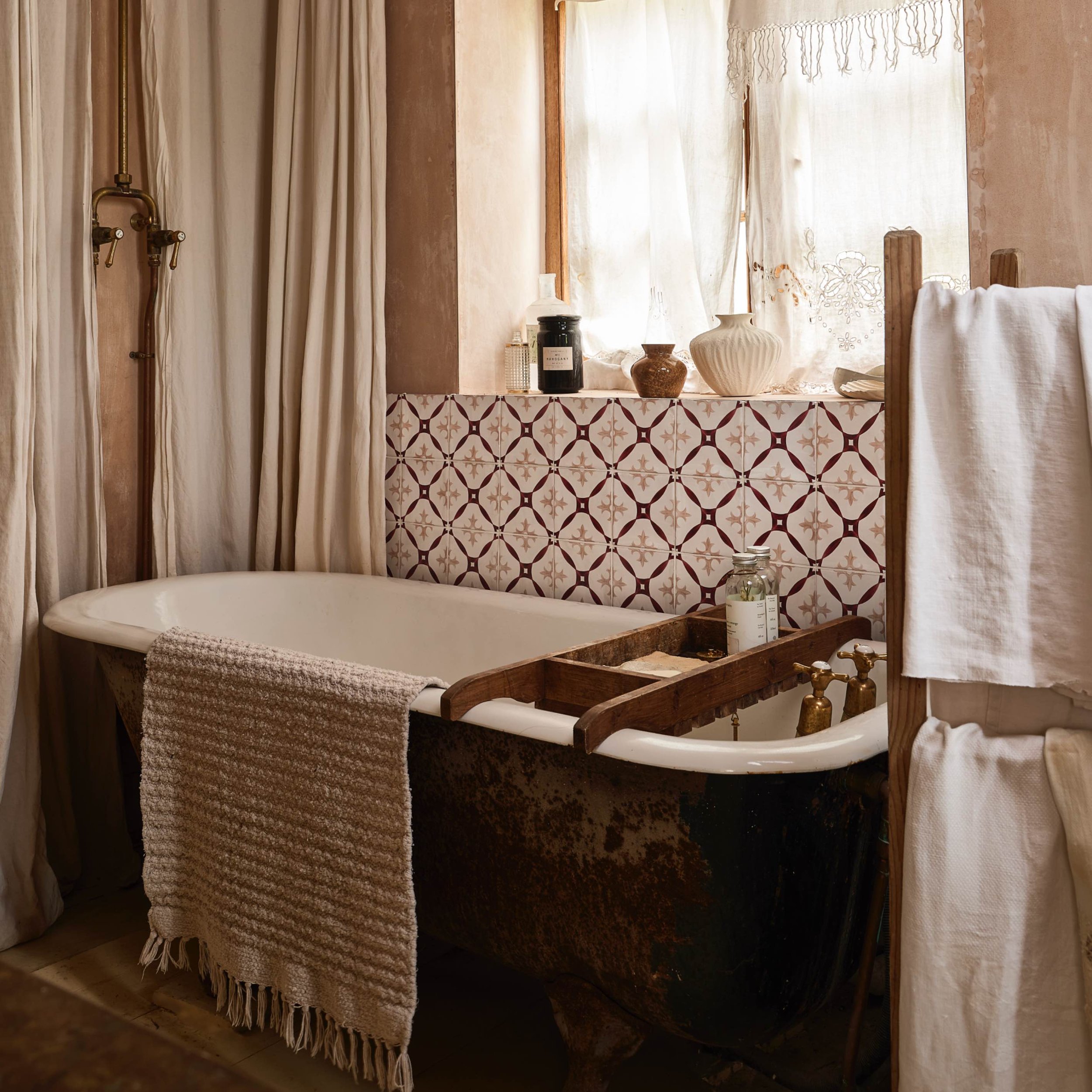
Geometrics can bring structure to a contemporary bathroom, while floral or heritage-inspired patterns add charm and detail. In a small cloakroom, a patterned floor can give the whole space its identity. In a larger bathroom, the same tile might be used to define the shower area, frame the bath or create a rug-like section beneath a vanity.
Think carefully about where the pattern begins and ends. A balanced layout will ensure the repeated design feels deliberate, particularly around edges, corners and sanitaryware. It is worth planning this before installation rather than allowing the most visible areas to be determined by chance.

Change the direction, change the room
Vertical tiles lead the eye upwards, creating a sense of height. This is particularly effective behind a basin or within a shower, where the lines can emphasise tall ceilings and elegant brassware. A vertical layout feels clean and contemporary without being overly complicated.
Keep it stacked
A stacked grid celebrates precision. The aligned grout lines create a calm, graphic effect that works beautifully with handmade tiles, where slight variations stop the layout from feeling too rigid. Choose matching grout for a subtle finish or a contrasting shade to make the geometry stand out.
Introduce herringbone
Herringbone brings movement and a sense of craftsmanship. It can turn a plain rectangular tile into a genuine focal point, whether used across an entire wall or in a smaller area behind a vanity. For a quieter interpretation, choose a tonal grout; for greater definition, use contrast to trace the zigzag pattern.
Try checkerboard
Checkerboard layouts are playful, graphic and surprisingly adaptable. Black and white will always make a strong statement, but softer combinations can feel more relaxed. Try cream and terracotta, warm white and olive, or two tones of the same colour for a gentler approach. Small squares work particularly well on floors, splashbacks and within compact cloakrooms.
Do not underestimate the grout
With smaller tiles, grout forms a greater part of the finished surface, so its colour deserves careful consideration. Matching grout allows the tile colour or texture to flow with fewer visual interruptions. Contrasting grout highlights the shape and layout, creating a bolder, more graphic finish.
A white tile with dark grout will feel crisp and defined, while white-on-white appears softer and more seamless. Coloured grout can be effective too, either picking up another shade within the room or adding an unexpected detail. Practicality matters, particularly on floors and within showers, so consider how the colour will look after everyday use as well as on the day it is installed.
Use small tiles in unexpected places
Small-format tiles are perfect for adding interest to areas that might otherwise be overlooked. Line the back of a niche, tile the side of a bath, create a border around a mirror or continue a floor tile up the front of a vanity unit. These smaller moments can make the whole bathroom feel more bespoke.
They can also help define different zones. A mosaic floor within a walk-in shower provides a visual change as well as working around the falls required for drainage. A tiled panel behind the bath creates a clear focal point, while a contrasting splashback gives a simple basin area more presence.
The key is to be selective. Giving one or two areas special treatment will often have more impact than asking every surface to compete.
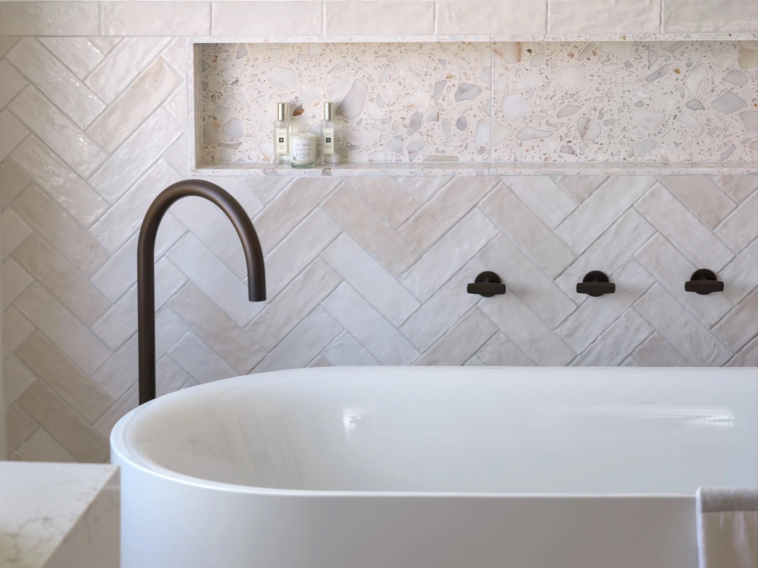
Rialto Terrazzo Bathroom Tile
The appeal of a small-format tile lies in its potential. A change of direction, a different grout colour or an unexpected placement can transform something simple into the defining feature of the room.
Whether you are drawn to the delicate detail of mosaics, the clean rhythm of kit-kat tiles, the familiarity of metro tiles or the playful curve of scallops, there is no single way to use them. The best schemes are the ones that consider colour, shape, layout and proportion together—and have a little fun along the way.
Visit your nearest showroom to explore our tile collections and discover how our experienced designers can use smaller-format tiles to give your bathroom a personality all of its own.

Martin Ogden imparts his expert knowledge on creating a thriving botanical bathroom.
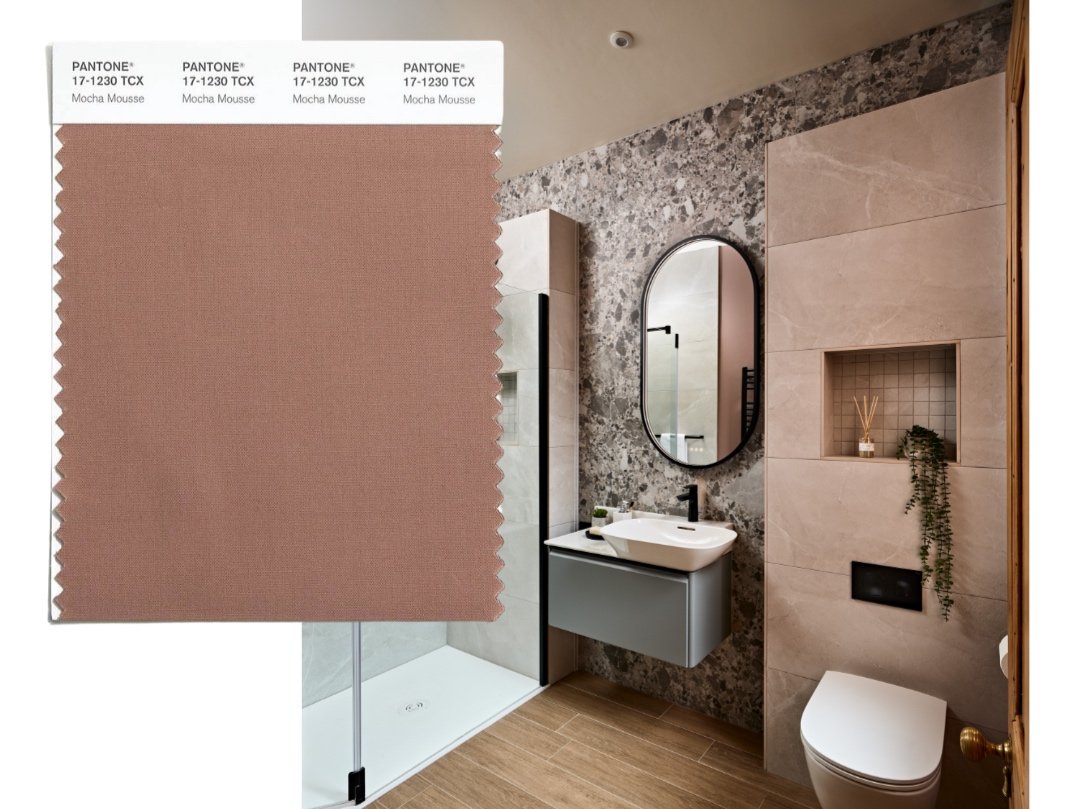
Mocha Mousse - Pantone colour of the year