
Bathroom Décor: Autumn in the Bathroom, the Tile Colours We’re Loving Right Now
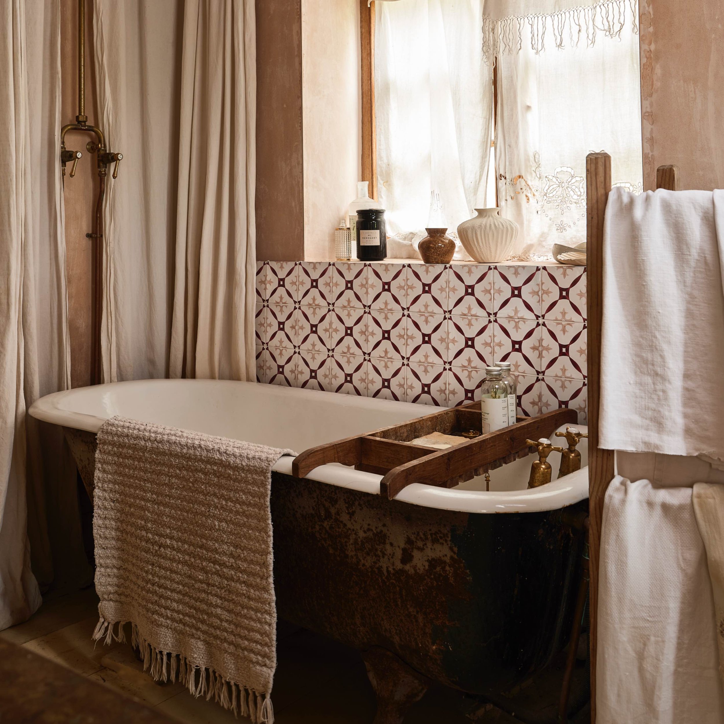
As the light softens and we begin to spend more time at home, richer and more grounded colours come into their own. From earthy reds and olive greens to warm neutrals and deep burgundy, these are the tile shades bringing depth, warmth and character to bathrooms this October.
Autumn has a natural way of changing how we think about our homes. As the days become shorter, we are drawn towards rooms that feel warmer, more tactile and more comforting. In the bathroom, this does not have to mean an obvious seasonal theme. Instead, it is an opportunity to explore a sophisticated palette of earthy colours that feels just as beautiful in October as it will throughout the rest of the year.
This season’s most inspiring tile colours are rich without being overpowering and warm without feeling overly traditional. Terracotta, ochre, olive, chocolate and burgundy all have a wonderfully grounded quality, while softer stone, sand and clay tones create the perfect balance. Used alone or layered together, they can make a bathroom feel welcoming, individual and deeply considered.
Earthy reds: warm, expressive and full of character
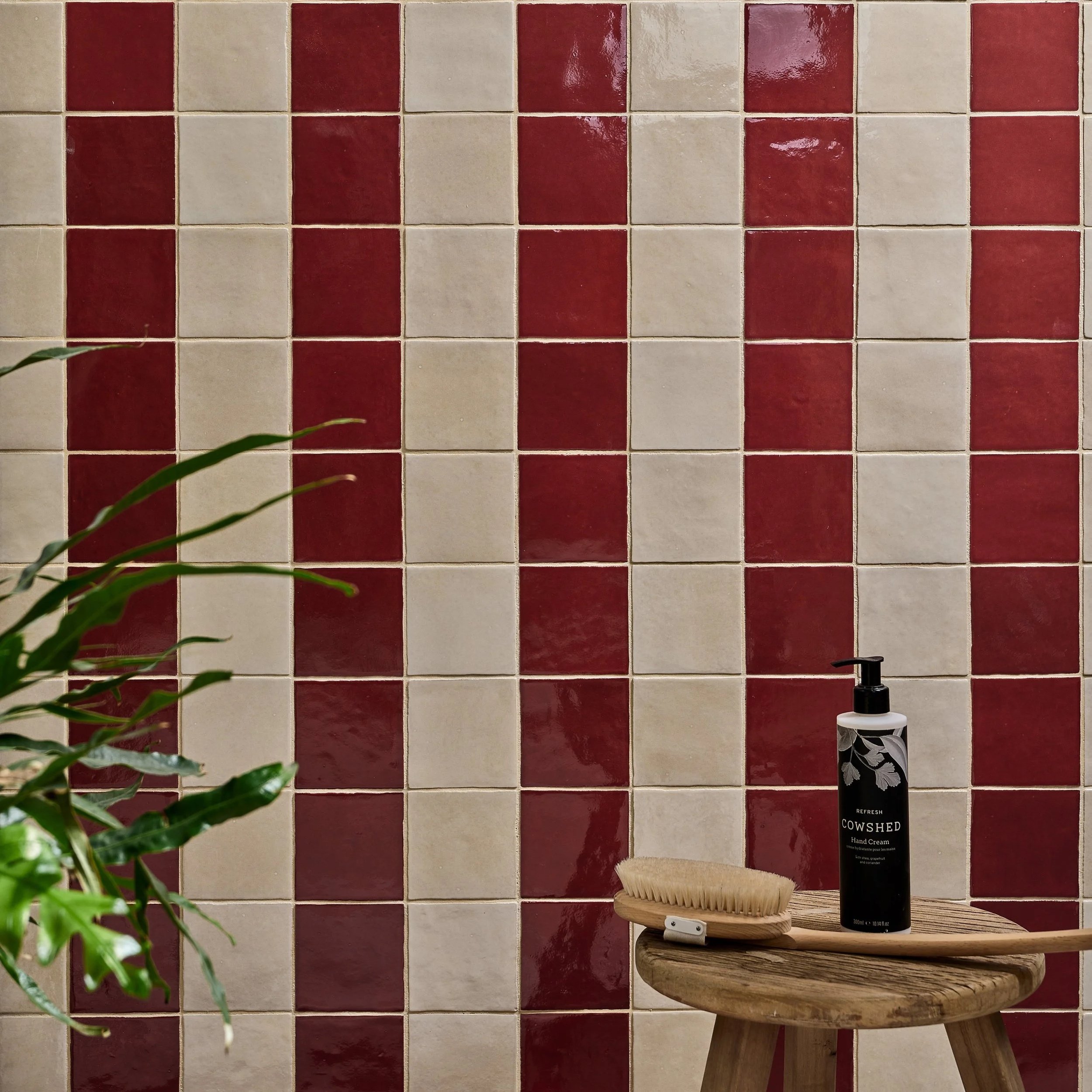
Earthy red tiles sit somewhere between rust, brick and sunbaked clay. More muted than a true red, they bring warmth and confidence to a bathroom without demanding all the attention.
These shades are particularly effective on a feature wall or across the floor, where their natural variation can add depth and movement. A glossy finish will reflect the light and reveal subtle differences between each tile, while a matt or textured surface creates a softer, more grounded look.
Pair earthy reds with warm white sanitaryware, aged brass finishes and natural timber for a relaxed scheme. For something more contemporary, introduce clean lines and cooler brushed metal details. The contrast will keep the colour feeling fresh and architectural.

Ochre: a softer approach to yellow
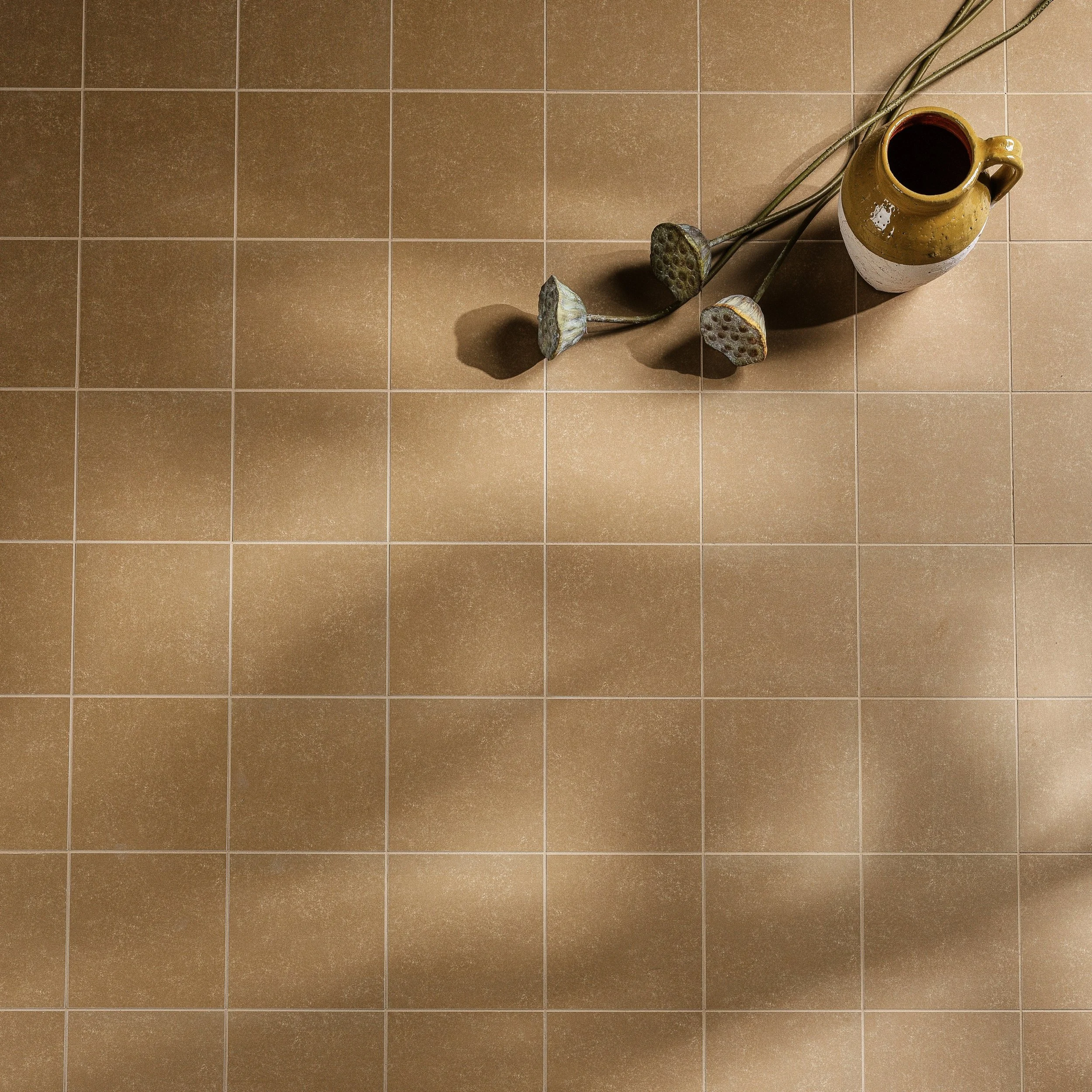
Ochre brings the optimism of yellow in a much more liveable form. It's warm, mineral quality works beautifully in bathrooms, particularly where natural light is limited, and a sense of brightness is needed.
Rather than covering every wall, consider using ochre tiles within a shower, around a bath or as a tiled splashback. The colour makes a strong impression in smaller areas and pairs naturally with off-white, sand and soft grey. It also looks striking alongside darker accents such as bronze, charcoal or deep brown.
Zellige-style or handcrafted tiles are especially effective in ochre because their uneven surfaces catch the light differently throughout the day. The result feels warm and characterful rather than flat, bringing a gentle glow to the room even on the greyest October morning.
[Image, Aventuras Ochre Bathroom Tile]
Warm neutrals: the foundation of an autumnal palette
Neutrals do not need to feel cool or clinical. Shades of oatmeal, mushroom, putty, sand and warm stone provide a calm foundation while still adding depth to the bathroom.
The beauty of a warm neutral lies in its versatility. It can cover large areas without overwhelming the room and allows bolder colours to be introduced through a vanity unit, painted wall, patterned floor or tiled niche. Layering several related neutrals is often more effective than relying on a single shade. A sandy floor tile, creamy wall tile and timber vanity will create a room that feels gently tonal and full of texture.
Pay close attention to undertones when combining neutrals. Some lean pink, others yellow or grey, and viewing samples together in the bathroom’s natural light will help ensure they sit comfortably alongside one another.
Olive green: natural, calming and quietly confident
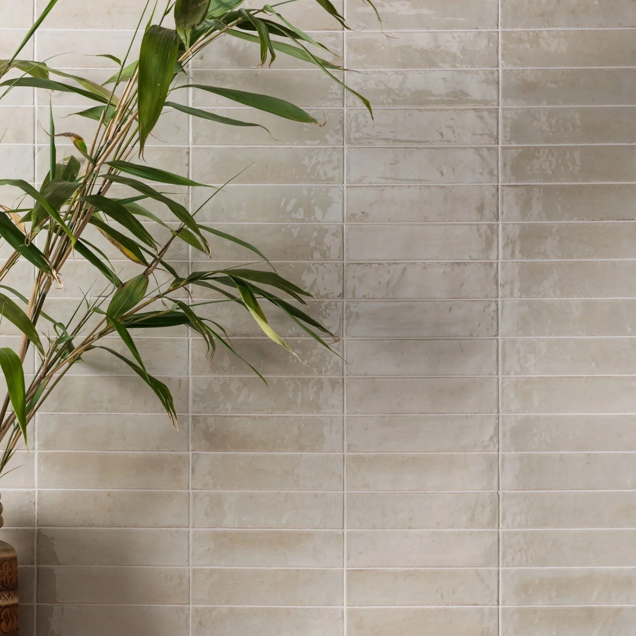
Green has become a firm favourite in bathroom design, and olive is particularly well suited to autumn. Softer and earthier than emerald, it creates a connection to nature while bringing a wonderful sense of calm.
Olive tiles can feel both classic and contemporary depending on how they are used. Choose a slim, glossy tile laid vertically for a modern shower wall, or a matt square tile for something more understated. In a cloakroom, olive can be taken across every wall to create an enveloping, jewel-box effect.
This grounded green pairs beautifully with warm neutrals, terracotta and chocolate brown. It also provides an elegant backdrop for brassware, although chrome or nickel can create a crisper finish if you prefer a cooler contrast.
Chocolate brown: depth without the severity
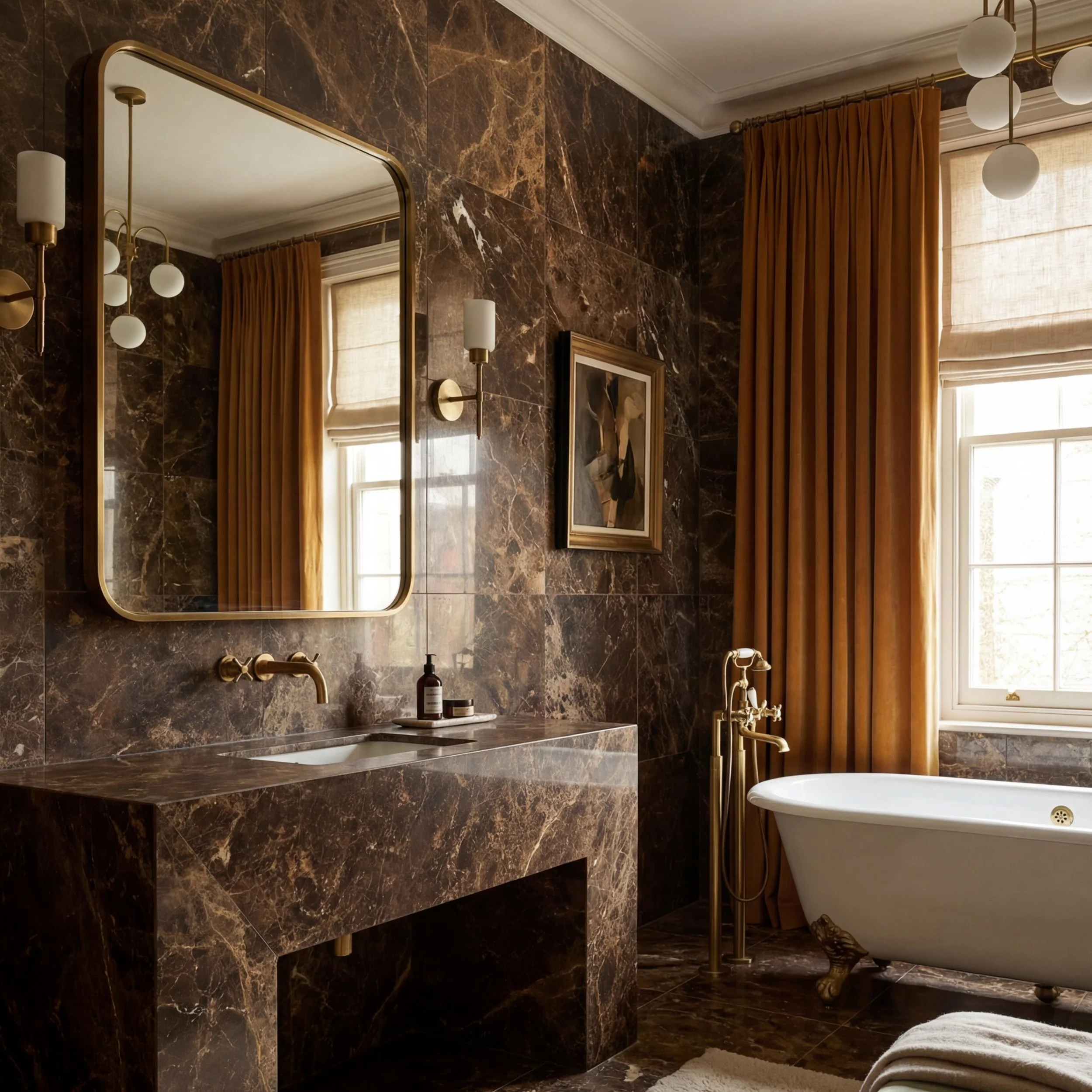
For many years, the darkest bathrooms relied on black or charcoal. Chocolate brown offers a warmer alternative, bringing the same sense of depth with a softer and more inviting finish.
Rich brown tiles work particularly well in larger formats, where fewer grout lines allow the colour and surface to take centre stage. Look for tiles with gentle veining, tonal movement or a subtle gloss to prevent darker areas from feeling flat. Used on the floor, chocolate brown can visually ground a light bathroom; across a shower wall, it creates an intimate and cocooning atmosphere.
Pair it with cream rather than brilliant white for a softer contrast. Travertine-inspired finishes, brushed brass and medium-toned woods will all complement its warmth, while a pale basin or bath will provide a clean visual break.
Terracotta: a timeless source of warmth
Terracotta may feel especially appealing in autumn, but its enduring quality makes it far more than a seasonal choice. Its warmth comes from its connection to natural clay, giving it an authenticity that works in both traditional and modern bathrooms.
Classic terracotta flooring can add instant character, especially when paired with plaster-like walls and simple sanitaryware. For a more contemporary interpretation, choose porcelain tiles that capture the colour and tonal variation of clay in a format that suits the room. Terracotta-effect tiles are available in everything from large slabs to small geometrics, making the shade surprisingly versatile.
The colour sits beautifully with olive green, dusty pink, warm white and deep burgundy. It can also soften sharper contemporary elements, adding warmth to minimalist furniture and clean-lined brassware.
Products we LOVE
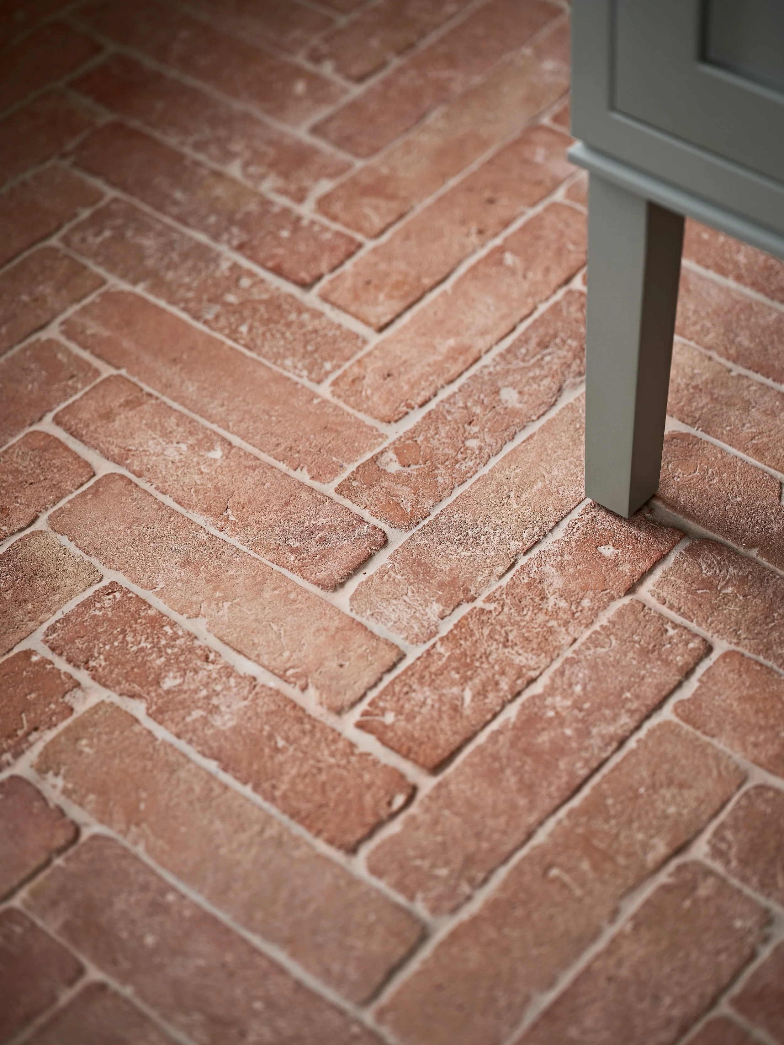
Terracotta Parquet Baththroom Tile
Deep burgundy: a touch of drama
Burgundy is one of the most luxurious colours in this seasonal palette. Rich and enveloping, it brings drama to a bathroom while retaining more warmth and softness than black.
A deep burgundy tile can make a beautiful statement behind a freestanding bath, within a walk-in shower or across the walls of a compact cloakroom. Glossy finishes intensify the colour and bounce light around the room, while matt tiles create a more velvety and understated effect.
Because burgundy has such presence, the surrounding design can remain relatively simple. Pair it with pale stone, warm white or soft pink-beige, then add restrained brass or bronze details. If using the colour across a large area, a considered lighting scheme will help reveal its richness rather than allowing it to appear too dark.
How to combine autumnal tile colours
The most successful schemes rarely rely on a single colour. Combining two or three complementary shades creates a more layered and personal bathroom, but the proportions are important.
Begin with one main colour, one supporting neutral and a smaller accent. Olive green tiles might be balanced by warm stone across the floor and a touch of terracotta within a niche. Alternatively, a neutral bathroom could be given depth through a chocolate vanity and burgundy splashback.
Texture can be just as important as colour. Mixing matt, gloss and lightly textured finishes allows neighbouring shades to feel distinct while remaining harmonious. Tile shape and layout offer another layer of interest: a rich colour used in a simple grid will feel very different from the same shade arranged in herringbone or a vertical stack.
Always view samples in the room itself before making a final choice. Autumn light can be soft and changeable, and artificial lighting will influence how warmer colours appear in the evening. Looking at the tiles at different times of day will give you a much better sense of the finished result.
A palette that lasts beyond the season
Although these colours feel particularly suited to October, their appeal extends far beyond autumn. Each one is rooted in natural materials, mineral pigments and the landscape, giving it an enduring quality that will not disappear when the season changes.
The key is to choose shades that you genuinely enjoy and use them in a way that suits the space. That might mean a full wall of rich colour, a patterned floor that brings several tones together or a single tiled niche that provides a carefully placed accent. A bathroom should feel personal, and colour is one of the most effective ways to give it its own identity.
Find your nearest showroom and discover how thoughtful design can transform your bathroom into your favourite room in the house.

Martin Ogden imparts his expert knowledge on creating a thriving botanical bathroom.
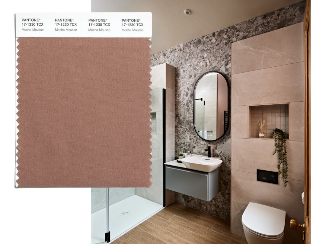
Mocha Mousse - Pantone colour of the year